SKILLS
logo design, brand development, social media visuals
ASK
a logo for Argonaut, a medical imaging device
Situation
Movu (short for "more views") is a subsidiary of Santec, creating advanced medical imaging devices. Their first device was Argos (named for the many-eyed giant in Greek mythology). Argonaut — the successor — is an optical biometric device that measures seven data points at once, then feeds them into an algorithm that consolidates data and images into accurate diagnostic information.
The naming is not accidental: Argos → Argonaut continues the Greek mythology thread. I used that as a quiet creative compass.
The client wanted a logo for Argonaut that felt modern and scientific, and complemented the existing Argos logo (a very clean, minimalist sans-serif wordmark with no imagery).

Approach
I explored four distinct minimalist directions while working through internal revisions with the creative director:
Faithful evolution – Kept Argos' font styling intact — safe and consistent.
Subtle wave throughout – Introduced a wave motif (ocean/journey) as a repeating graphic element.
Wave as path – Placed the wave specifically between the A and U, making it read as both a wave and a journey/path visual.
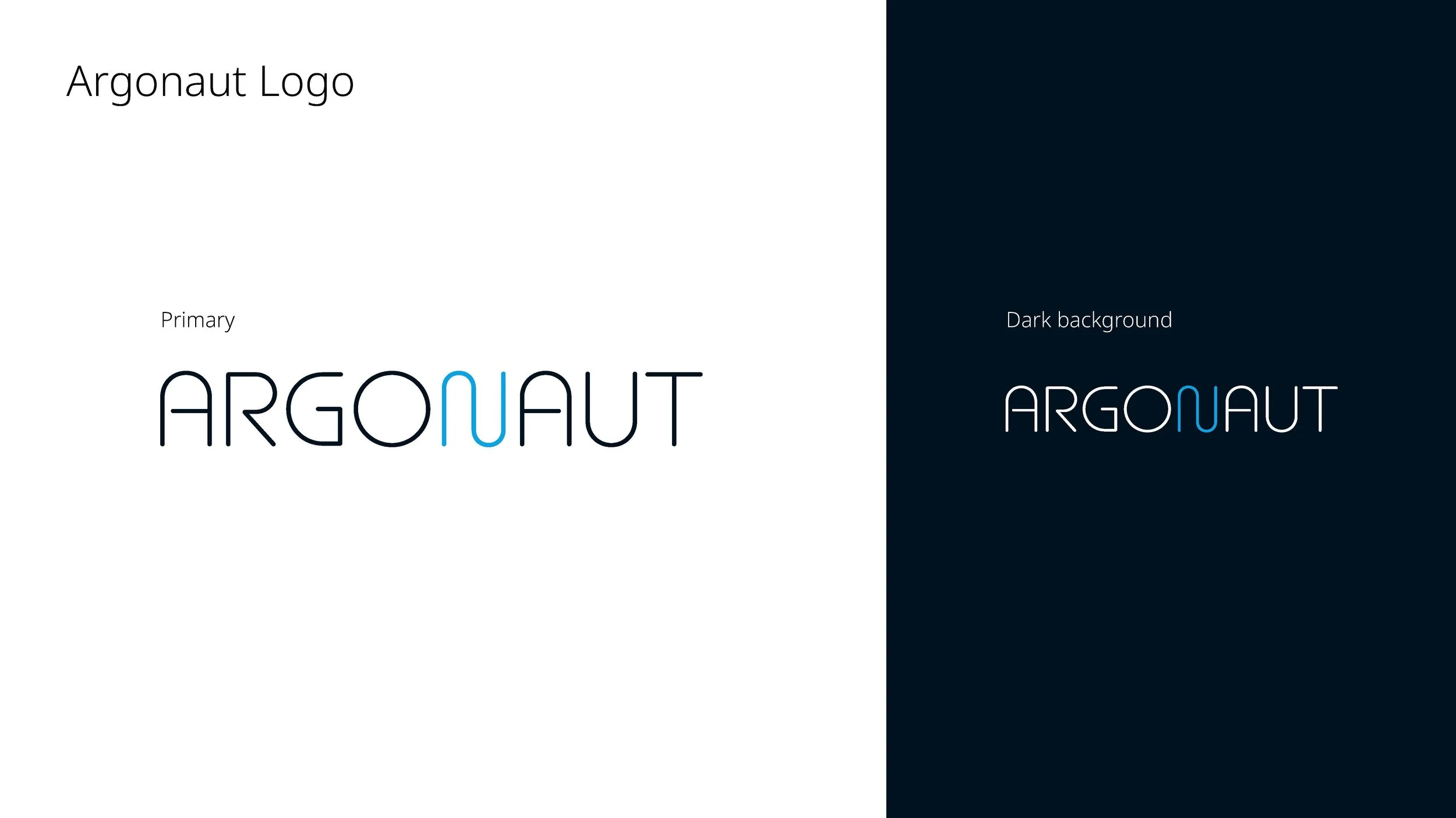
Unique N as asset – Similar to option 1, but with a distinctive blue N designed to be pulled out and used as a standalone graphic element.
The client chose option 4.

Building the brand system:
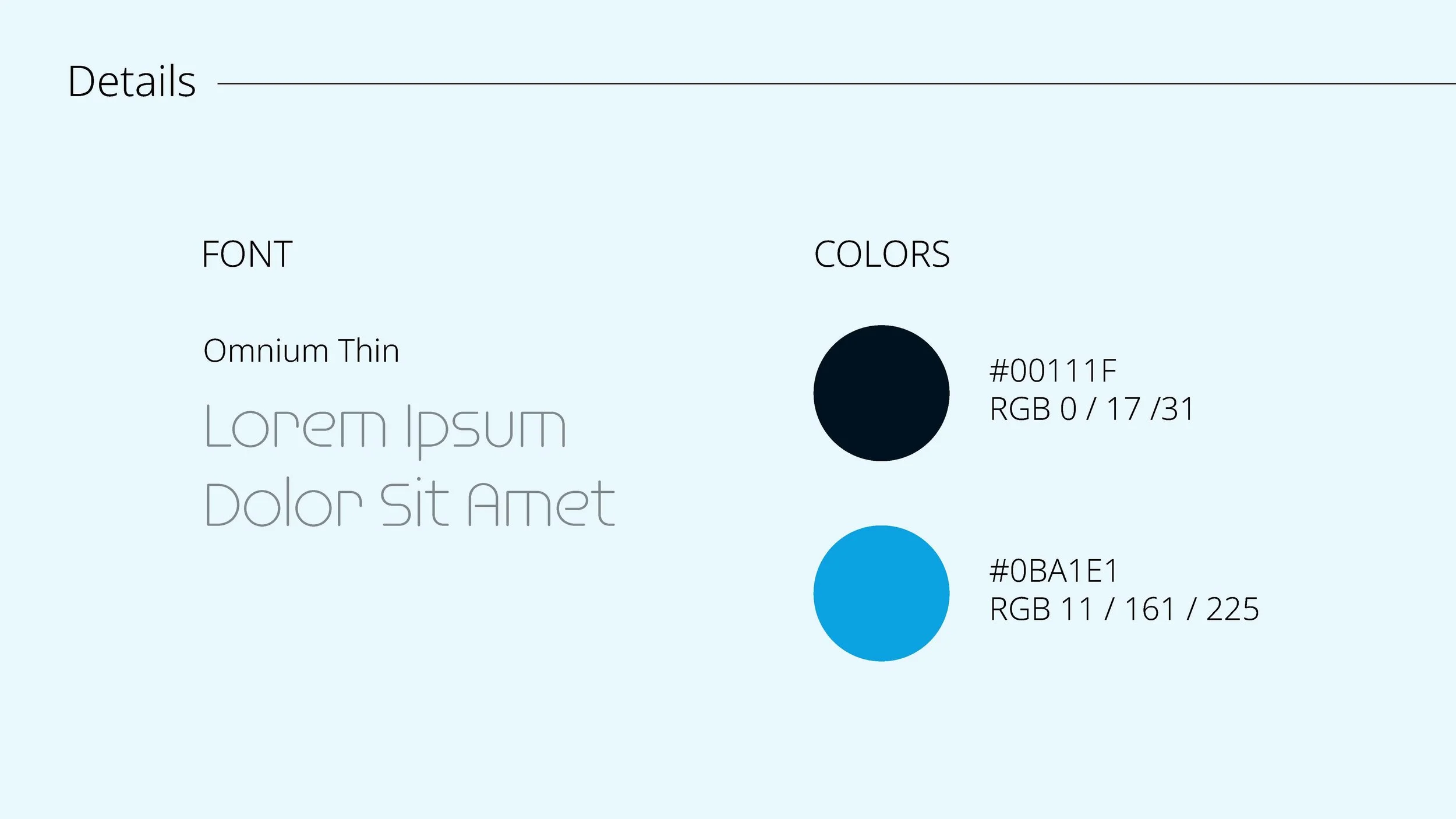
Color palette – Dark backgrounds with light text for a high-tech feel, using bright blue as an accent. Blue is common in healthcare and, in this case, fits the wave/journey theme.
Typography – Futuristic font from the logo for headlines; clean sans-serif for body copy.
Social media visuals – Banners and posts leading up to product launch, featuring the unveiled product and the team behind it.

Impact
Strategic options presented – Four distinct concepts showed the client different ways to balance heritage (Argos) vs. innovation (wave/journey vs. modular N).
Built-in brand system – The blue N is more than just a letter. It’s a reusable graphic element for social posts, website accents, and trade show materials.
Launch foundation – The logo and initial visuals set the branding groundwork as Movu moved toward product launch.
Mythological resonance – The wave shape of the N is a subtle nod to the Argonaut myth.