SKILLS
website layout, accessibility-focused design
ASK
a clinical trial website for Diabetic Macular Edema (DME)
Situation
Biopharmaceutical company Oculis needed a website for one of their clinical trials. The trial focused on Diabetic Macular Edema (DME) , which means the primary audience was older adults — many of whom may already have vision challenges.
This created two core constraints:
Accessibility first – Larger fonts, high contrast, and easy-to-read layouts weren't optional; they were central to the brief.
Tone balancing act – The site had to feel modern and friendly to appeal to potential trial participants, while still being appropriate for a clinical trial (credible, not frivolous).
Approach
I worked from the Oculis brand blue (keeping family resemblance) and developed two distinct concepts in Adobe XD:
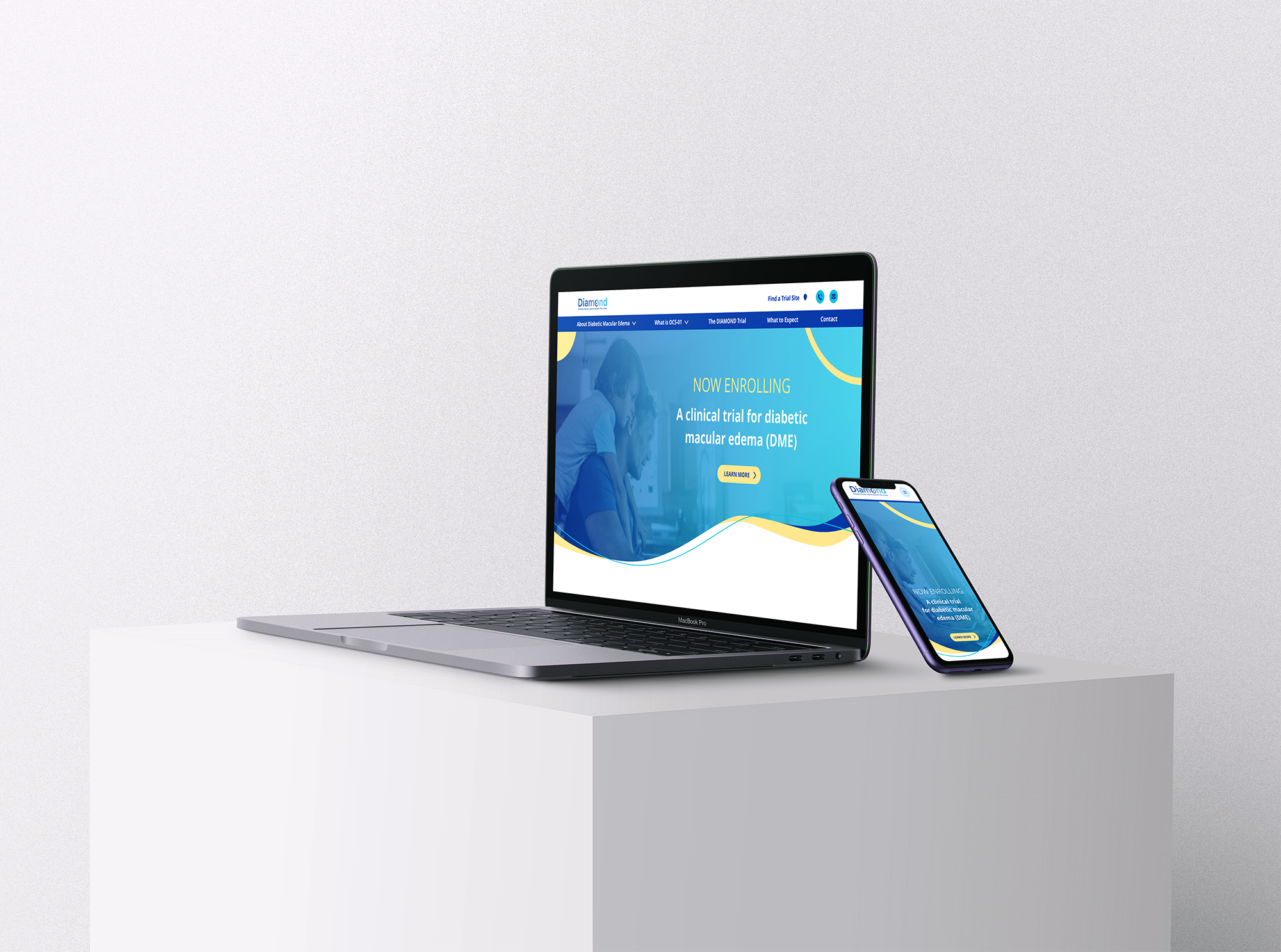
Concept 1 (whimsical/friendly) – Blue and yellow palette with abstract shapes. The goal was warmth and approachability. Challenge: Finding the line between "friendly" and "too playful for a clinical trial" took several rounds of refinement with the creative director.

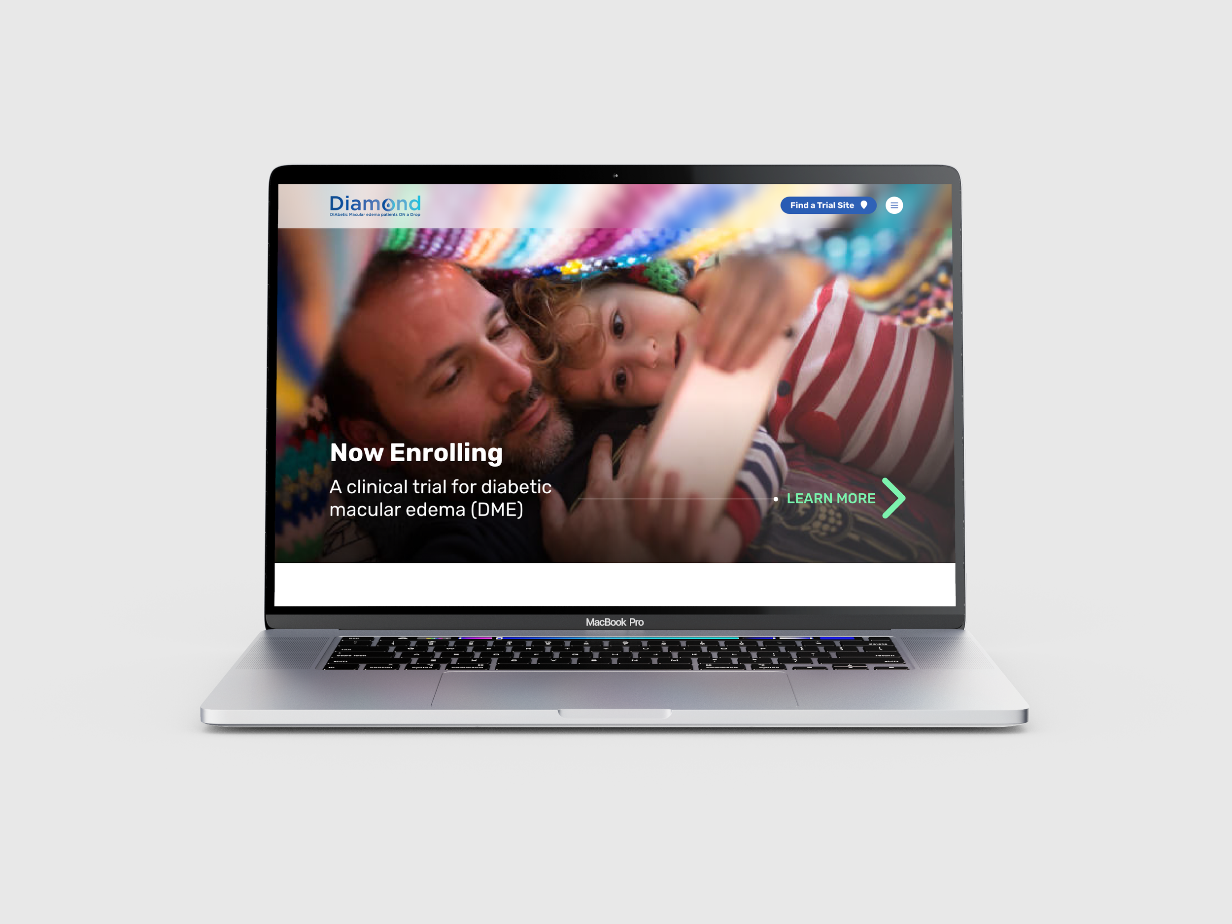
Concept 2 (modern/sci-fi) – Saturated blue with a bright sea foam green accent. Cleaner, more futuristic, relying on geometry rather than abstract shapes.


The copywriter provided a manuscript with calls-to-action and headlines, which I used to inform layout hierarchy. After client review, they chose Concept 2. A few rounds of design tightening followed, then I handed off the XD files for implementation (by an external contractor).
Accessibility approach: While we didn't formally WCAG-test, the agency's standard practice was to design for obvious readability — large type, strong contrast, clear buttons — which aligned perfectly with the DME audience's needs.
Impact
Live, public-facing work – The site launched and is still live at diamondtrial.com (though the final design evolved slightly after handoff).
Audience-appropriate design – The modern/sci-fi aesthetic balanced clinical credibility with a tone friendly enough for patient recruitment.
Clear handoff – Provided XD files that allowed a contractor to implement without additional design oversight.
Brand consistency – Used the blue from the main Oculis branding as the anchor, ensuring the trial site felt connected to the parent brand while having its own distinct identity.
